Claiborne Colombo is an artist, Creative and Design Director based on Lopez Island, WA.NOTES
Making art and designing things where the land meets the sea. A visual record of art, life, design, and inspiration among all other things…
Nailed It.
"Barbara Kruger famously began her professional career as a designer for Mademoiselle and other magazines before defecting from the mass-media overculture to join the conceptual-art resistance. And she didn’t join the cause empty-handed. In her work, Kruger hacked the magazine world’s finely turned tools of cultural communication to begin conveying slogans that went in direct contrast to social conventions (particularly when it came to women): “gender is irrelevant,” for instance, or “your body is a battleground.” Many works declare positions that seem anthemic but then become more and more ambivalent with time, and, in this piece, “Culture Vulture” is both a mark of pride for its owner and an occasions for reflection on the more predatory sides of the arts industry." – ARTSPACE
Insert excuse here.
... And so life goes. This new year I have been really bad about getting in the studio. Bathroom remodel + travel have taken priority over my little sacred space. I was pulling out artwork to take to a friend for her birthday and it hit me I have made little to no progress on my body of work. It happens. It's not a bad thing I just need to get back after it. In the meantime this is a snapshot of what January & February have held.


Introducing : A R T L O V E
sometimes you just need to stop and look around you. for art and design it always is helpful for me to look to others who also create for some inspiration. meet my brainchild ::: A R T L O V E ::: it's a personal project that acts like an online gallery and catalogues artwork that i love. i hope it introduces people to artist and pieces they wouldn't have seen otherwise. most importantly, i hope it inspires.
Work by Katie Batten.
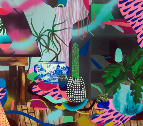
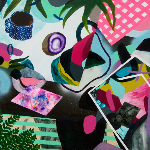
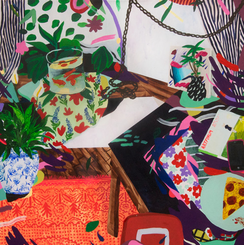
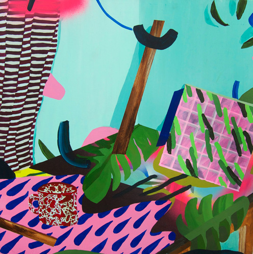
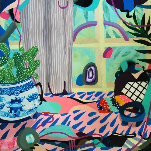
Loving these energetic still life's that mix pop-culture with a folk art feel. It brings a refreshing lift to the conventional form. Great interview on little paper planes with artist (read here).
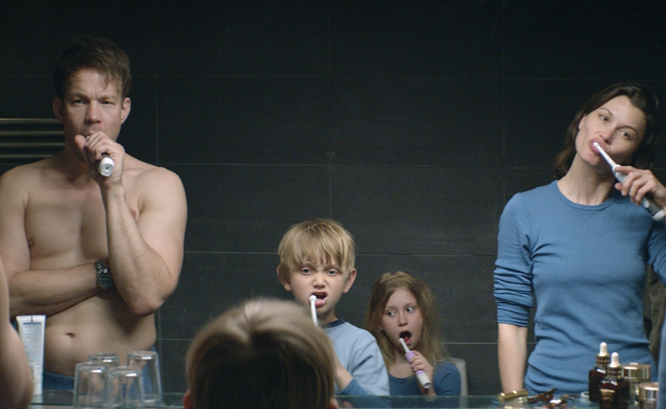
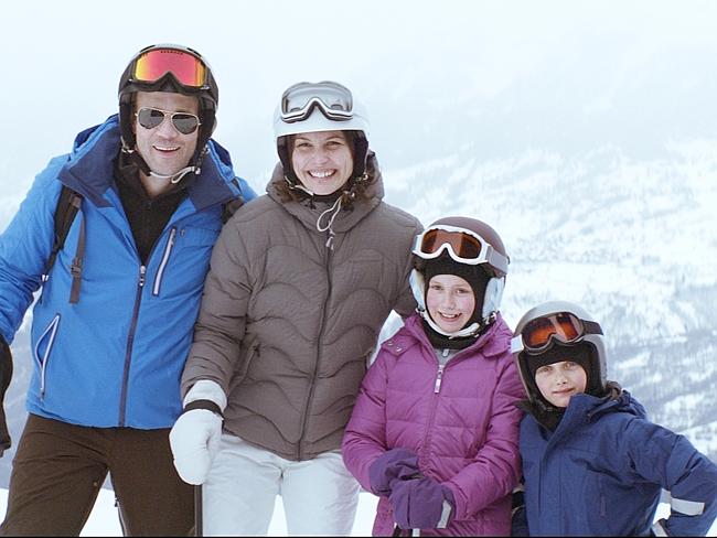
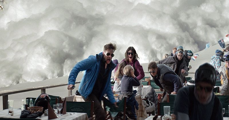
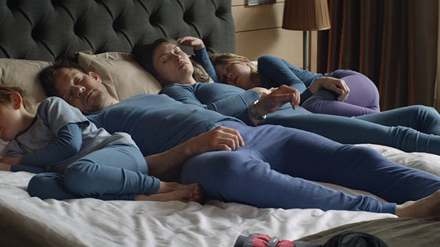
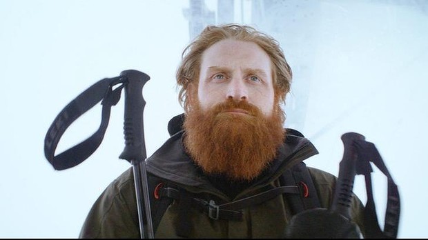
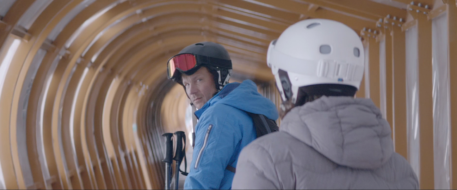
Humility in humor: Force Majeure.
Force Majeure Trailer for the Cannes Film Festival 2014 movie directed by Ruben Östlund
What I love about this film is how subtle human interaction creates humor throughout. Even though the avalanche is an extreme event that triggers the storyline it is purely a commentary on how humans react to events and one another. This is what makes it relatable, humble, and endearing. Also the art direction is beautiful.
Finding legs.
The creative process is similar throughout different fields. Since I work in advertising my critical thinking for art tends to parallel with the concepting process.
Color series thus far has been in the concepting phase. It's mostly exploring and finding different directions of what it could be but there is no solid idea yet. But now time to mold and shape these pieces into a cohesive body of work. Some will get left behind, some will have new life breathed into them.
I started by evaluating the different pieces - why the strongest is successful and why the weaker ones aren't working as hard. This reflection phase is all about picking favorites and dissecting intuition. I do a lot of listening to my own thoughts and to people who offer their opinion.
At this point I have decided to go in the direction of No. 1.
For me, No. 1 is the strongest for different reasons. Here are my fluid thoughts on what I like about it.
I like that it looks like a head, it's like a psychedelic skull, it reminds me of kid cudi's album cover, the white space makes you think it could be a brain or represent the inside of what is going on in someones head, i love the colors, its all complex and fluid and maybe that what i like to think is going on in my head.
So then I wondered what a family of head-space paintings would look like. Would they all draw you in and make you think? For me, I can see multiple of these retaining their integrity instead of feeling like half-ass replicas. Lets find out and lets see if this sucker has legs.
Keep on keepin' on.
Taking a look at my color series pieces I've decided that the strongest pieces are the ones that are more complex. Yes, drips are beautiful but that is it. The drip pieces feel more decorative where the ones that have more to them draw you in. It makes the brain try to see something in form, try to make a connection. So I will continue down this path. It is the harder path, no doubt about it. I am already wondering how I am going to pull it off. I think it will be by not overthinking and just doing. Easier said than done but here I go.
Fresh start.
Website: Launched.
It's been fun getting all of the work together. Seeing where I've been makes me excited to find where i'm going.
Color series and Black & White are starting to come into their own. I can't wait to get back in the studio and see where it all takes me.
Keep me sane.
“I always felt that if you do something you love, you should find a way to get paid for it. That is one reason I became an illustrator. I could always do work on my own and if I was lucky enough to sell a painting and make some extra money that was good fortune. Illustration didn’t come naturally to me — I worked very hard to understand how to make my illustration work more ‘commercial’ and acceptable. My natural inclination and ability is towards the fine arts, which I continue to do and always have done throughout the years.”
– Barbara Nessim
Fearless.
“If there’s a single principle that connects these [artist], it’s their fearless use of color and an ostensible belief that more is always more.”
Unearthly Beauty.
“Rembrandt. Velázquez. Late Titian. They make jokes. They amuse themselves. They build up the illusion, the trick—but, step closer? it falls apart into brushstrokes. Abstract, unearthly. A different and much deeper sort of beauty altogether. The thing and yet not the thing.”
This material may be protected by copyright.
Wet Brushes.
watercolor makes you work fast. have to be quick and switch brushes often. then pause and enjoy watching it change as it dries.
